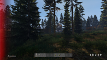
I feel like the hit markers are a bit too arcady for a vanilla 1pp version. Mayby it works for a 3pp but I dont play that.
The hit splash is very red and invasive as seen on the first image.
The SVisuals mod has an example of how a bleed looks on screen (I know you guys are working on that for next year, just for visual reference)
Might be worth making it look more like this, more on the borders, though the mod might be a bit too discoloured.
You can see that at the other 2 images.
Also not sure if Infected hitting you are in need of a splash, but you might have put that in just for us to see it more.


