Please provide an option to disable the watermark as its currently too big on the screen, I struggle to keep immersed. Either give us an option to disable it or make it smaller and towards the lower side of the screen.
Cheers :)
Please provide an option to disable the watermark as its currently too big on the screen, I struggle to keep immersed. Either give us an option to disable it or make it smaller and towards the lower side of the screen.
Cheers :)
Please disable the watermark or provide us with a decent reason as to why it is there. As far as I can see it really serves no purpose and just looks bad for the user.
Might put people off testing the patch and therefore could affect 1.26 feedback.
Agree 100%, I am an enthusiastic player on EXP and generate plenty of tickets, however this watermark is very distracting and can't see why it is necessary to be so large and opaque on screen, or needed at all. Aren't you changing enough with the game as it is, without foisting this unnecessary aggravation on us at the same time?
I can see a reason for wanting to put a version string in an obvious place on a dev version.
But we really don't need that giant DAYZ logo. We know what game we're playing.
Yeah version number kinda makes sense sure but the watermark makes experimental unenjoyable to play and therefore unenjoyable to test.
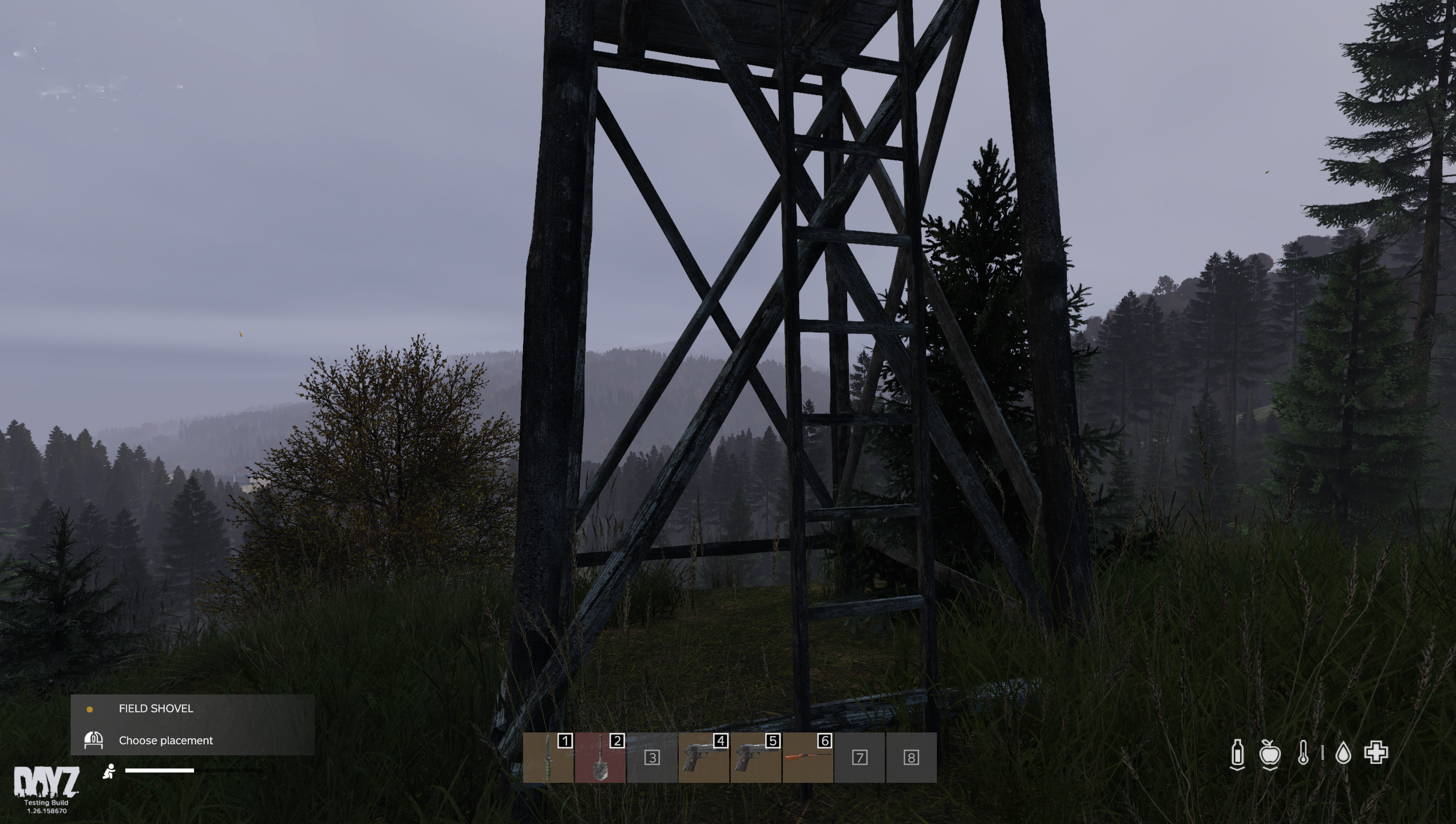
I inputted a screenshot below, the green box highlights typically where a player looks this takes up a large majority of the screen and typically in gameplay the sky is taking up most of the view, the watermark when on display stands out massively when the background is off the sky or even a forest as an example. Typically like the UI is already is pushed down to the bottom of the screen in the red area. This is where players often do not look unless they need to gather information about their character via the HUD elements. This is exactly where the watermark should be if you intend to keep it on for experimental. Remove the DayZ logo as it is not needed, having a simple text is enough.
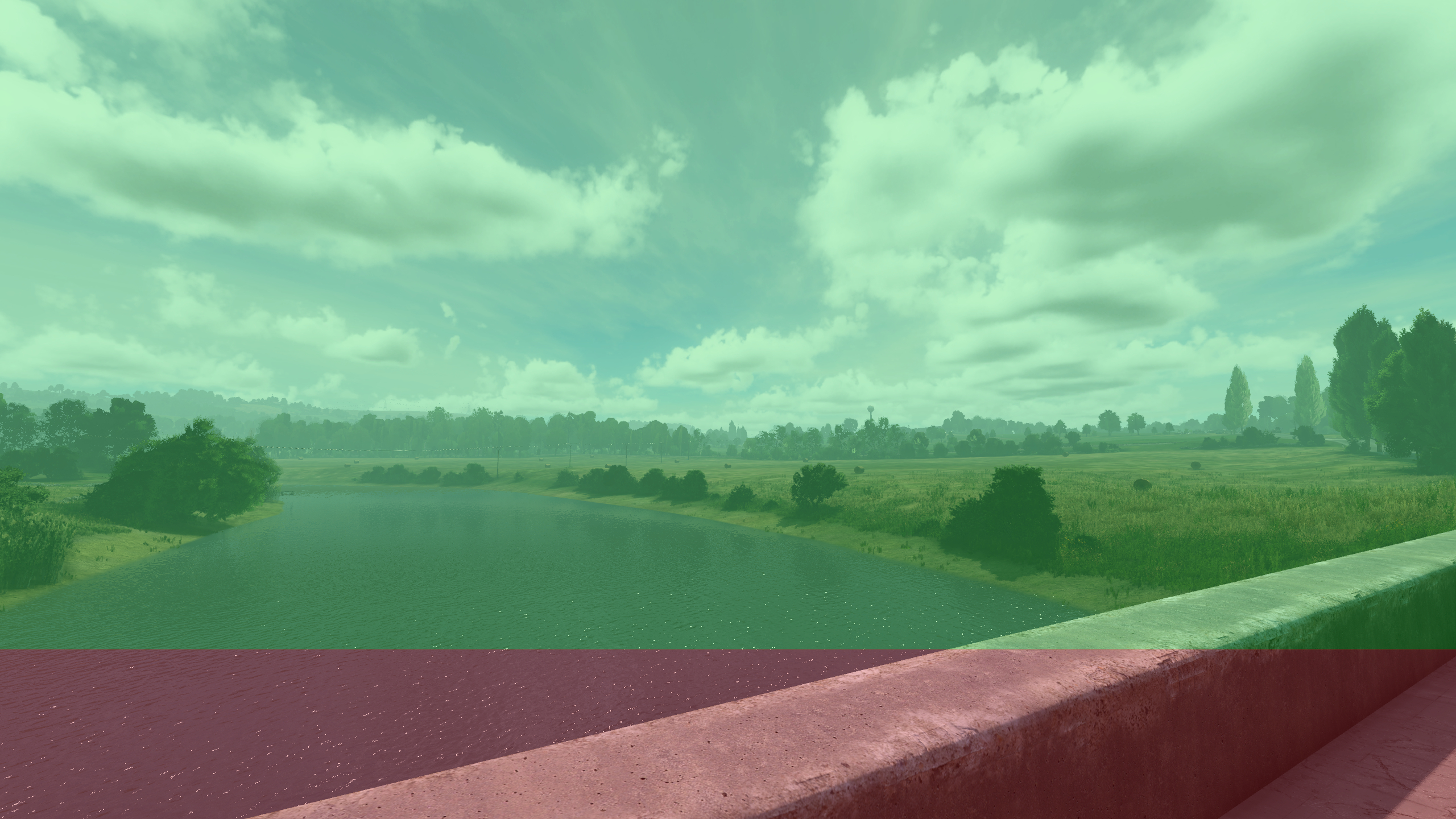
I have also inserted a mock up example of a nice text showcasing the version without it being intrusive on the gameplay. It is tucked away at the bottom left corner of the screen (also away from the other HUD elements which people focus on more, health, food etc)
I understand the need of having the version number on a screenshot but the logo is far too much. Tuck it away at the bottom of the screen away from with just simple text, make it white so it blends in with the other HUD elements.
Cheers devs <3
Yes please!
Logo away, version if needed by devs is ok.
Here's how I would do it (Picture only for illustrational purposes, not the actual 1.26 experimental)
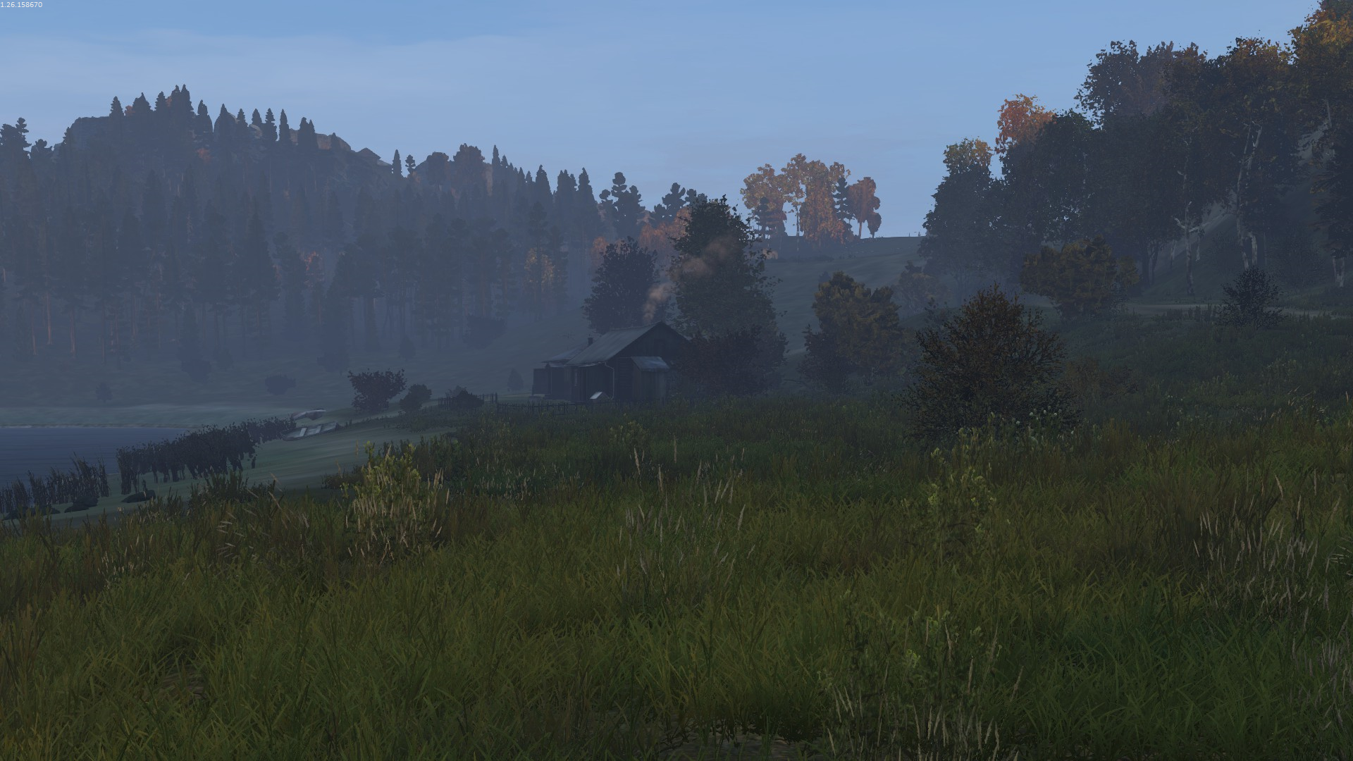
Great point, totally agree. If it's deemed truly necessary, the logo could at least be reduced and size and placed in this red zone at bottom. On the upside, i did notice that the watermark dims with the HUD. That helps a bit. I stopped noticing it so much after a couple hours in game. Just not a good look though. Some part of your brain can't help think you're playing on a menu screen. Here is a look with reduced logo tucked in the lower left corner.