Page MenuHomeFeedback Tracker

Multiplayer lobby- role text not easily read when selected
Closed, ResolvedPublic

Description

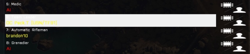
The red and yellow texts are fine and easy to read. however, when you select a role, the white flashing/ glowing box obscures the player's role and makes their name very difficult to read.

bottom line: impossible to read white/ pale grey on white background, very difficult to read bright yellow on white background

Details

Legacy ID
281142287
Severity
Minor
Resolution
Open
Reproducibility
Always
Operating System
Windows 7
Category
Menu UI
Steps To Reproduce

use a contrasting colour rather than white as the glowing box, maybe a darker grey or more matt colour.

alternatively do away with the glowing box altogether (the text and layout is very clear to read) or just have an initial glow to confirm/ highlight before the box fades away

Additional Information

I have attached a screenshot, showing the low contrast that is causing the difficulty.

Event Timeline

Peck edited Steps To Reproduce. (Show Details)Mar 7 2013, 2:22 AM
Peck edited Additional Information. (Show Details)
Peck set Category to Menu UI.
Peck set Reproducibility to Always.
Peck set Severity to Minor.
Peck set Resolution to Open.
Peck set Legacy ID to 281142287.May 7 2016, 11:16 AM
Peck added a comment.Mar 7 2013, 2:28 AM

just in case anyone is thinking what I would: my graphics are normal, gamma, brightness, contrast etc are all det to default/ normal and not the cause of the issue

was about to report this as well, thx

Confirming. Specially when you join a host first, the selection is not pulsing and remains almost white, so you have to click somewhere first (choose a role) before you can read the selected row.

@Astaroth it's fixed. See screenshot.
https://i.imgur.com/4Jd4Tm2.jpg
Ticket can be closed.

Dwarden closed this task as Resolved.Dec 6 2019, 8:06 PM
Dwarden updated the task description. (Show Details)
Dwarden edited Steps To Reproduce. (Show Details)
Dwarden set Operating System to Windows 7.