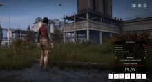
It would look cleaner and also allow more mods to be displayed under the play button if the icon is refactored to be right aligned. The first icon aligns with the right edge of the play button and then any additional mods are appended to the left of that fist icon.
Description
Description
Details
Details
- Severity
- Tweak
- Resolution
- Open
- Reproducibility
- N/A
- Operating System
- Windows 10 x64
- Category
- General
