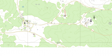
Town names are very hard to read. White on white isn't a good combination.
My suggestion is to decrease map brightness to make white text easier to read - it would also make it have a less of a flashbang effect.
Map details should also be visible without zooming in.
