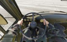
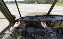
The glass shader used for the new Buchanka is different from other vehicles and kind of breaks the unity of the graphic design that all the other cars had between them. But another issue is that the dashboard's gauges are a bit harder to read due to the glare of the shader.
Compared to the Ural for example which is fine
Thanks !

