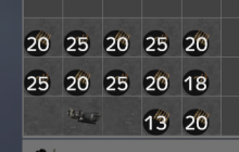
See the attached screenshot. The number text is so big that it covers the ammo icon, making it difficult to distinguish without hovering over it to read the name.
The text has to be big to be readable, but perhaps the icon could be improved somehow. Perhaps adding some colour codes?
Description
Description
Details
Details
- Severity
- None
- Resolution
- Open
- Reproducibility
- Always
- Operating System
- Windows 10 x64
- Category
- Visual-Weapons
Additional Information
Game version 1.0.150192
Event Timeline
Comment Actions
Hello Eadgar and thank you for the report.
This is an issue we are aware of and it is going to be resolved in the future.
Regards,
Geez
Comment Actions
Looks a bit better in 1.01, still not ideal though compared to the whole inventory window size overall.
