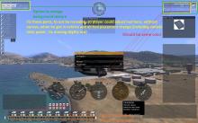
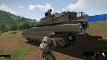
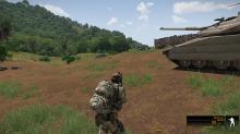
First - Command bar - Names of soldiers are useless, and should be able to hide.
Second - Color of crew role in vehicle - should be same color as text of "in game" elements (from color settings in game)
Third - and one of most important - In layout settings, on elements like "Weapon info", "vehicle info" should be half transparent frame showing how those elements move after getting in vehicle - very easy to implement and will eliminate confusion given on gameplay when we suddently discover our hud is not the same as we setted, in layout settings, after getting in vehicle.
Fourth - Option to change background texture in Hud elements - 3 to choose would be nice. Its would be nice refresh of HUD elements, and beside standard gradient (vertical)
we could choose gradient frame (for example), where there is no transparent in center of element, and on its edges background slightly disapear. Plus gradient horizontally.
Thats very easy and can be done in one day with your knowledge. Dont let this report gone and please report it immidently as high priority, otherwise i will not be able to see the effect - i will get too old :) I'm sure UI guys will agree with all of those steps.


