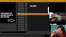
- The tree view of the Select Image window is too narrow. Names in the first subfolder are already cut off.
- The width of the column for the picture names should be reduced.
- The size for the image preview should be increased. (I can hardly tell where I took that picture from the preview ;) )
- Names in tree view overlap the border.
- The mission directory should be displayed by default. I personally use loading screen pictures as steam preview also
Resolution: 1920x1080
Interface size: normal
Version: ["Arma 3","Arma3",160,136406,"Stable",true,"Windows"]
